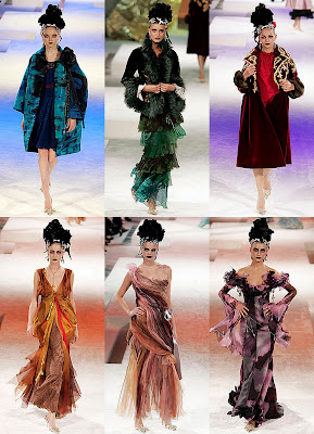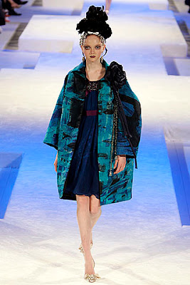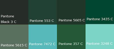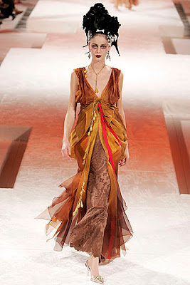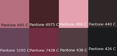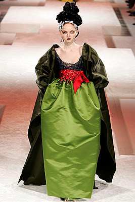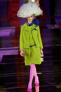

Referring to the last few years of Lacroix fall collection, it could be easily found out that he likes to use colors with high values and shades colors. From the above picture, we can see that "black" color is being used by him. However, if we look it carefully, we can analysis that Lacroix actually is using the high value colors . I believe that Lacroix may also use these colors in the coming haute couture collection as this is his practice.
Besides, Lacroix used the vivid colors in his collection and usually are aggressive colors. With the sharp colors on the couture, it can greatly reflect the energy and elegance in one.

as the color of 2009 was suggested as Mimosa,


Source:http://www.pantone.com/pages/pantone/pantone.aspx?pg=20634&ca=10
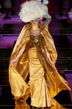
and Lacroix use yellow color for the couture, here are the color that I suggest.
Yellow means Hope and Courages.

With the different brightness of yellow color, the couture can be applied the monochromatic color scheme and being harmony.
Moreover, with the passion pf Lacroix for the theatre, he gets many inspiration from it. Recently he took part of the costume design in the famous opera Romeo and Juliette.

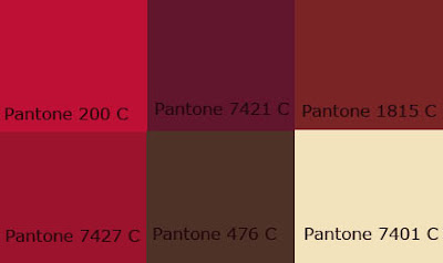
Lacroix may continues his passion in the coming collection. The classic elements will never be out-dated. The brilliant and glamorous style was more suitable for couture more than ready-to-wear. For the color, Lacroix may use the Red as red means his passion and the glamour power of ladies. On one hand, it means Love but on the other hands, it can also means as hatred, danger and excitement.
Also, the Violet color may also be used in the collection since this color represent superiority and royalty.

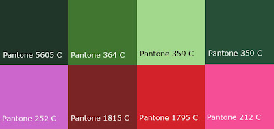
The above colors are the forecasting of the following collection.
By using the above colors, the analogic colors scheme (red-violet, red, and violet) is applied. It makes the couture being more splendid.
If Lacroix use the above colors together with the Mimosa, that the color of 2009, then it will become the analogic and complimentary color scheme.


First of all, the achromatic color scheme would appear in the collection as these are the basic elements. Black color not only give a sense of formality but also the sense of elegance, which can greatly reflect the ideal woman image of Lacroix's mind.


Lacroix also interesting and addicted to ballet, opera and theatrical style. He miss the times he spent in the theatre. Therefore it is not hard to find that there are lots of theatrical elements in his collections.
For this reasons, the follwing colors may use in the 09/10 fall Haute Couture Collection.

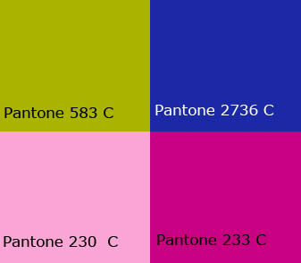
Apart from that, the triad color scheme also being used. The three colors are yellow, red and blue. Yellow represent sunshine, idealism, joy and happiness. Lacroix had mentioned that fahison is the best way to escape from the reality. Red means the desire and passion and blue means the stability and harmony. The changes in value and chroma can draw people attention easily.
For the single color itself, it also present the monochromatic color scheme with the tint color (Pantone 706 C), shades color (Pantone 1935 C) and tone color (Pantone 493 C).

